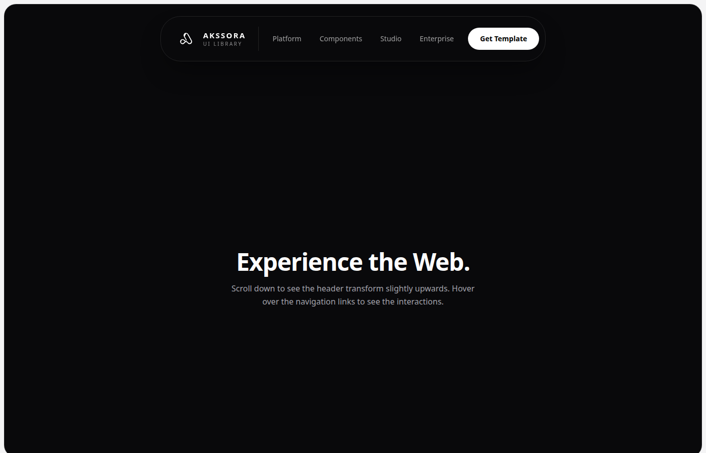
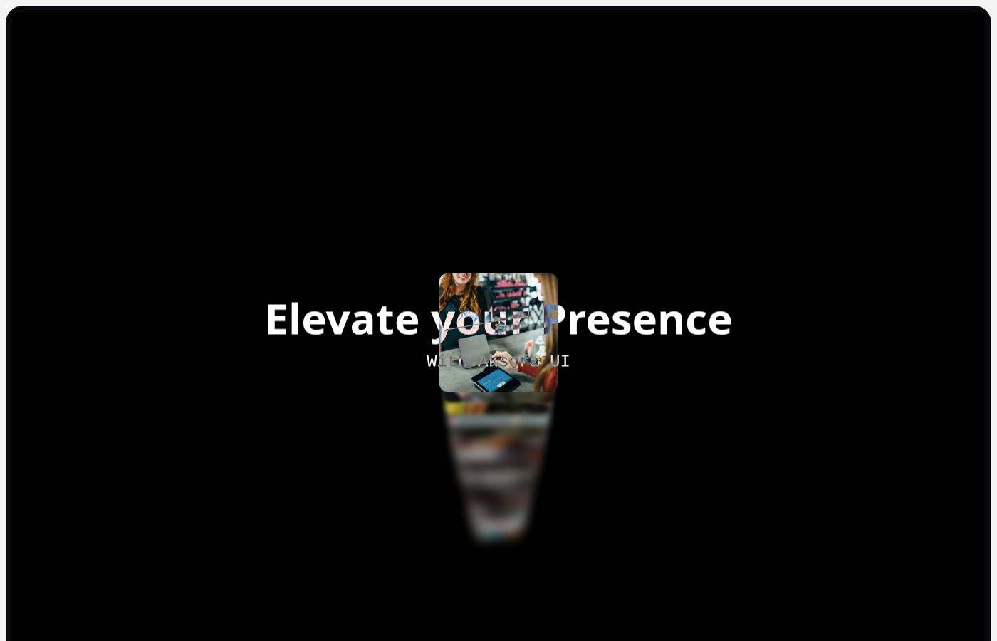
Buildstunning
User Interfaces
with ease.
Empower your web applications with beautiful, accessible, and customizable components designed for modern developers.
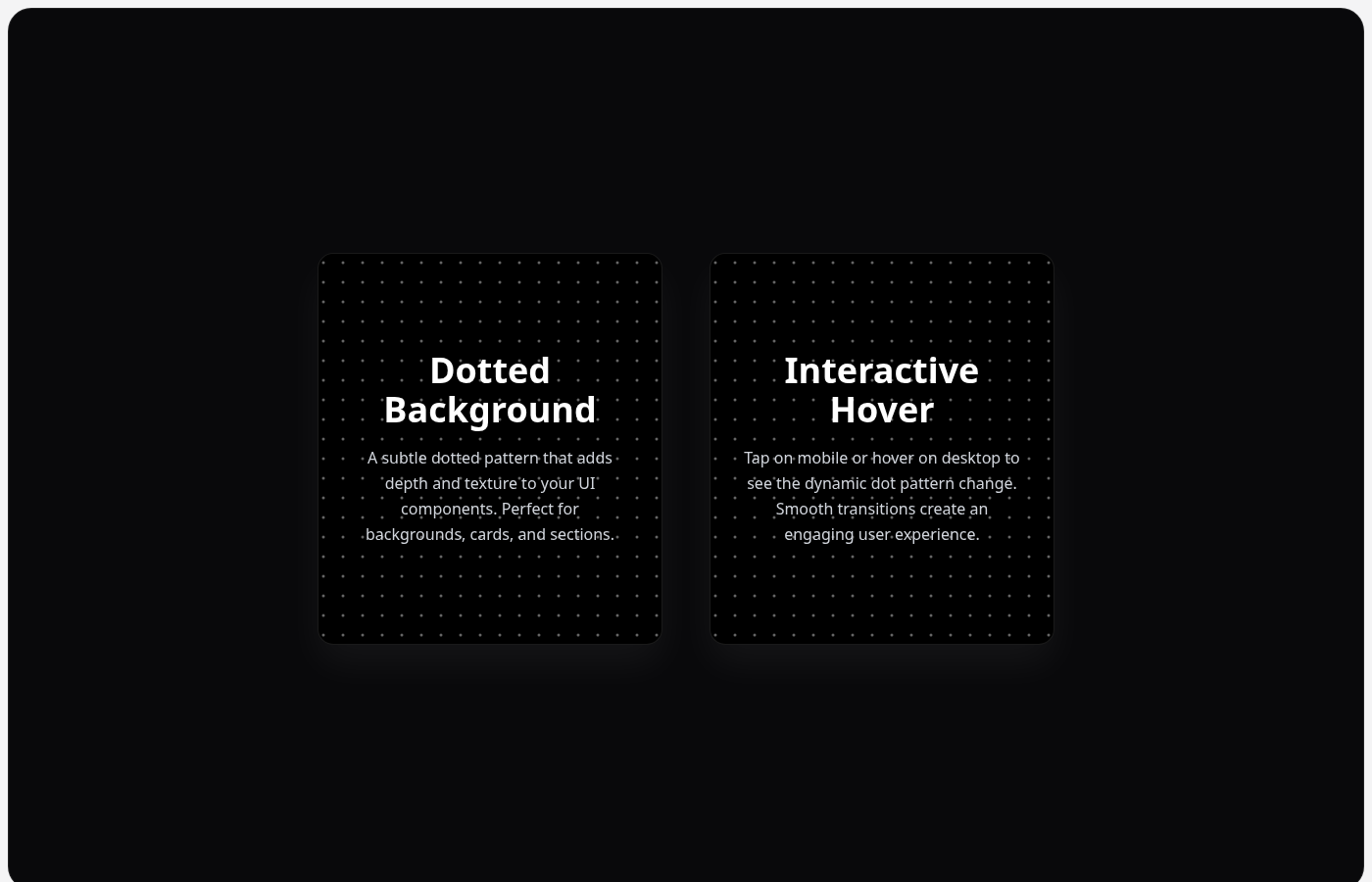
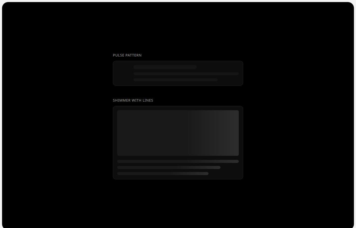
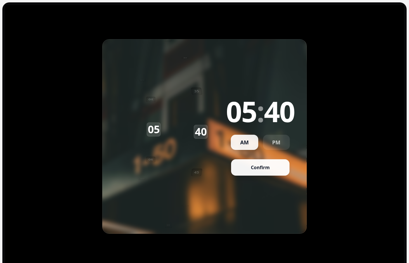
The
Collection
Index of hand-crafted elements
Index
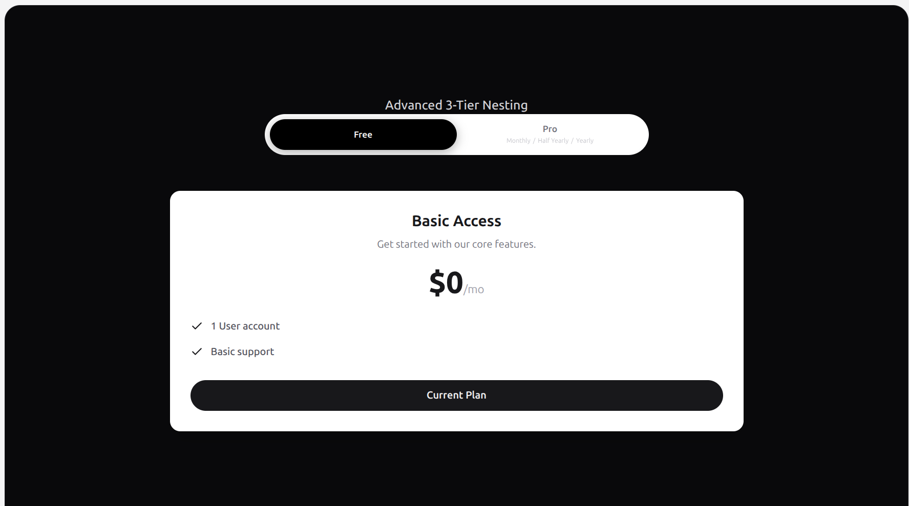
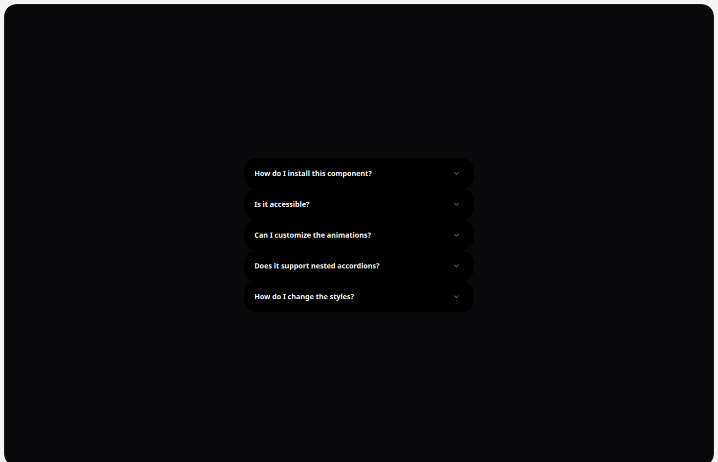
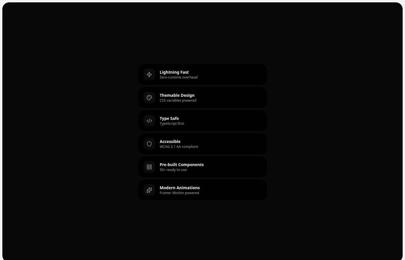
Components
Results: 033Total: 033
Empower your web applications with beautiful, accessible, and customizable components designed for modern developers.
Index of hand-crafted elements