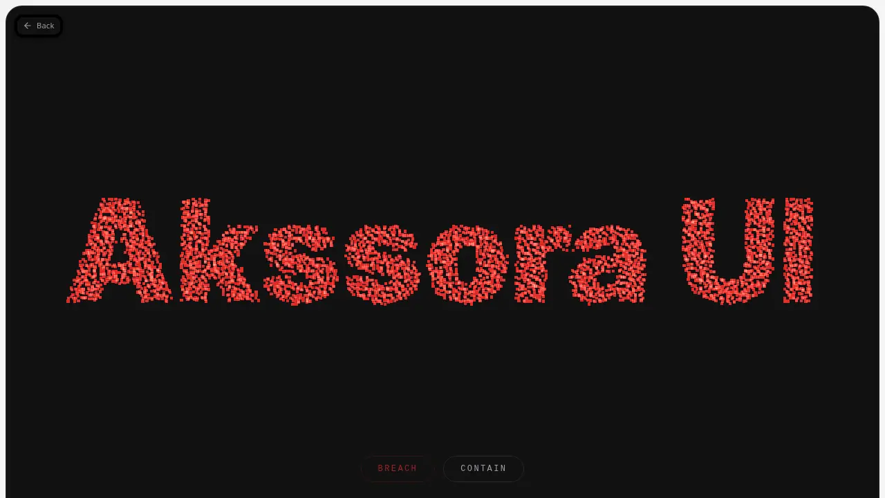
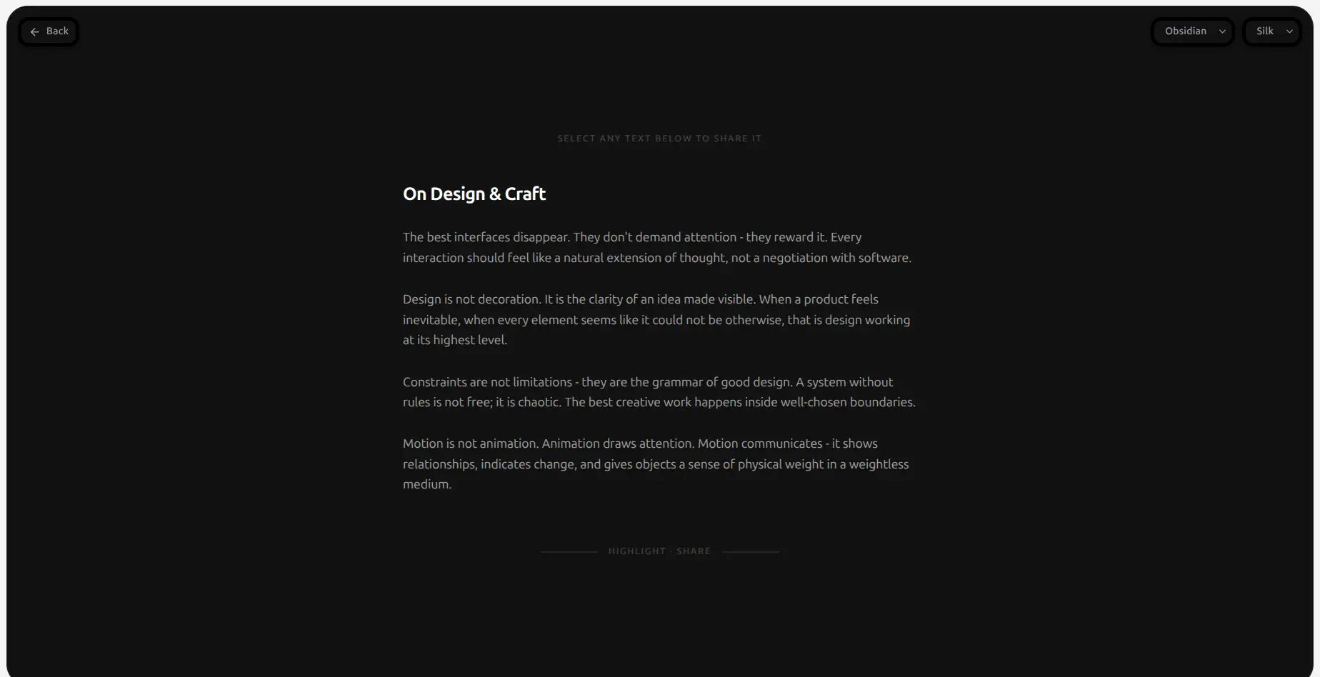
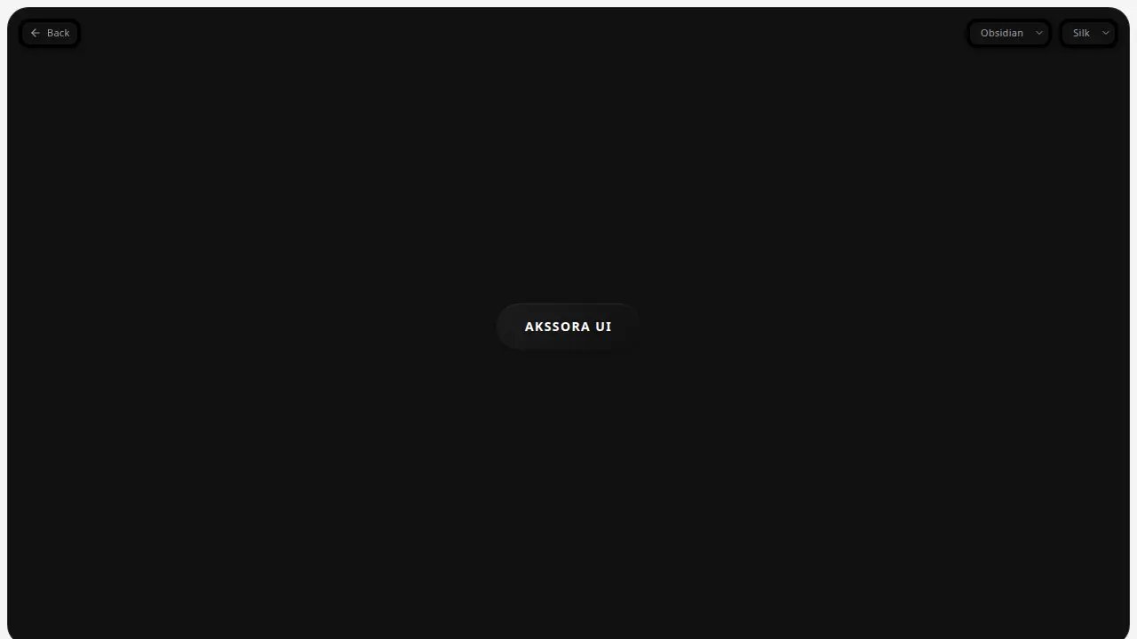
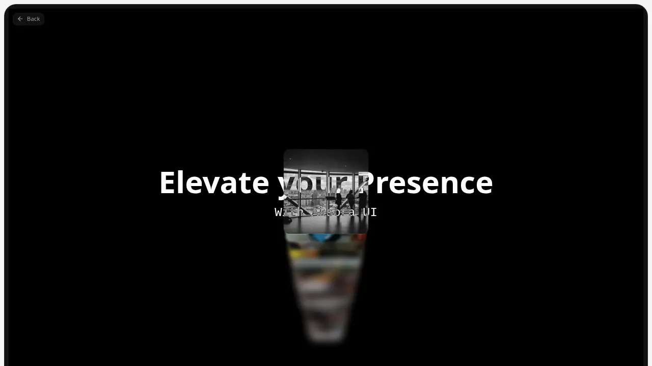
AKSSORAUI
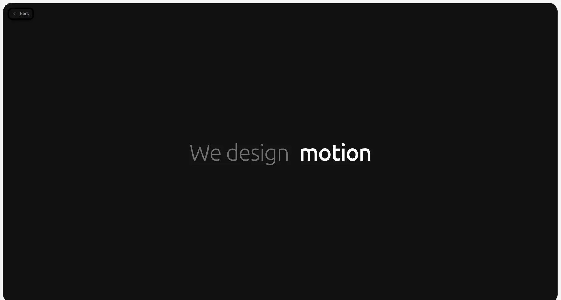
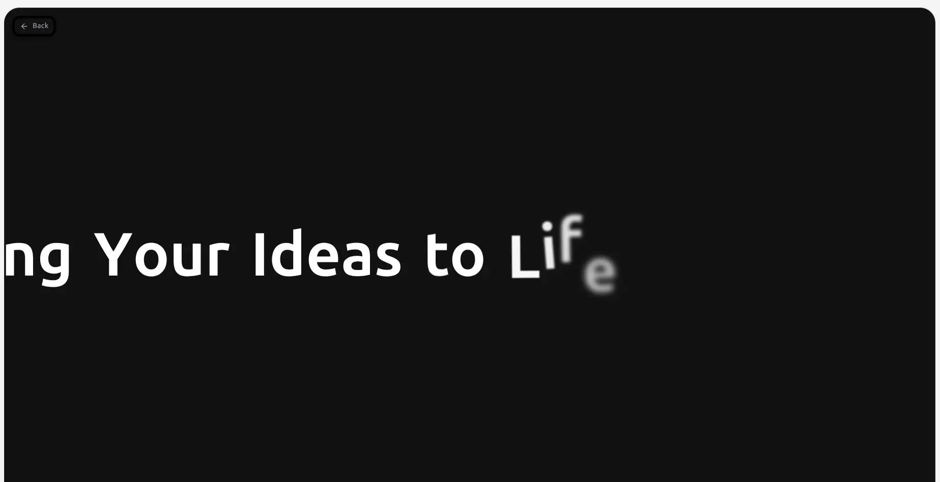
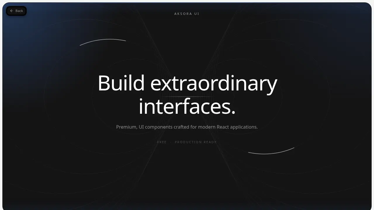
Interfaces thatSimply Flows
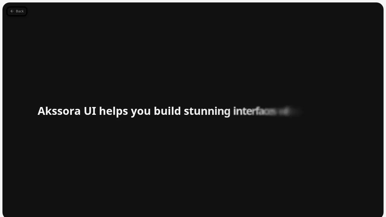
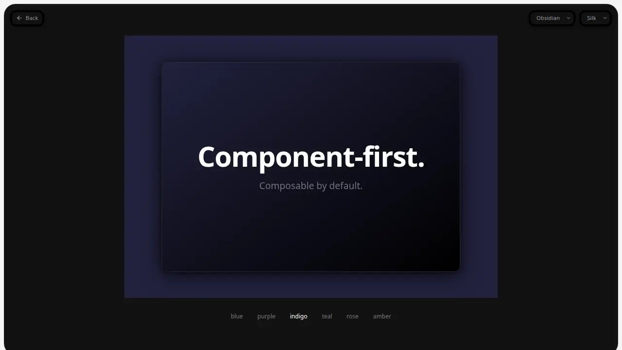
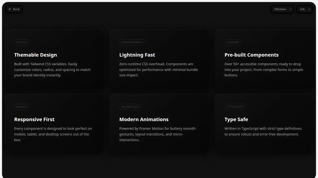
A curated set of accessible, animated React components in silk and edge variants. Install from the registry, own the code, and ship polished interfaces in minutes.
The
Collection
Index of hand-crafted elements
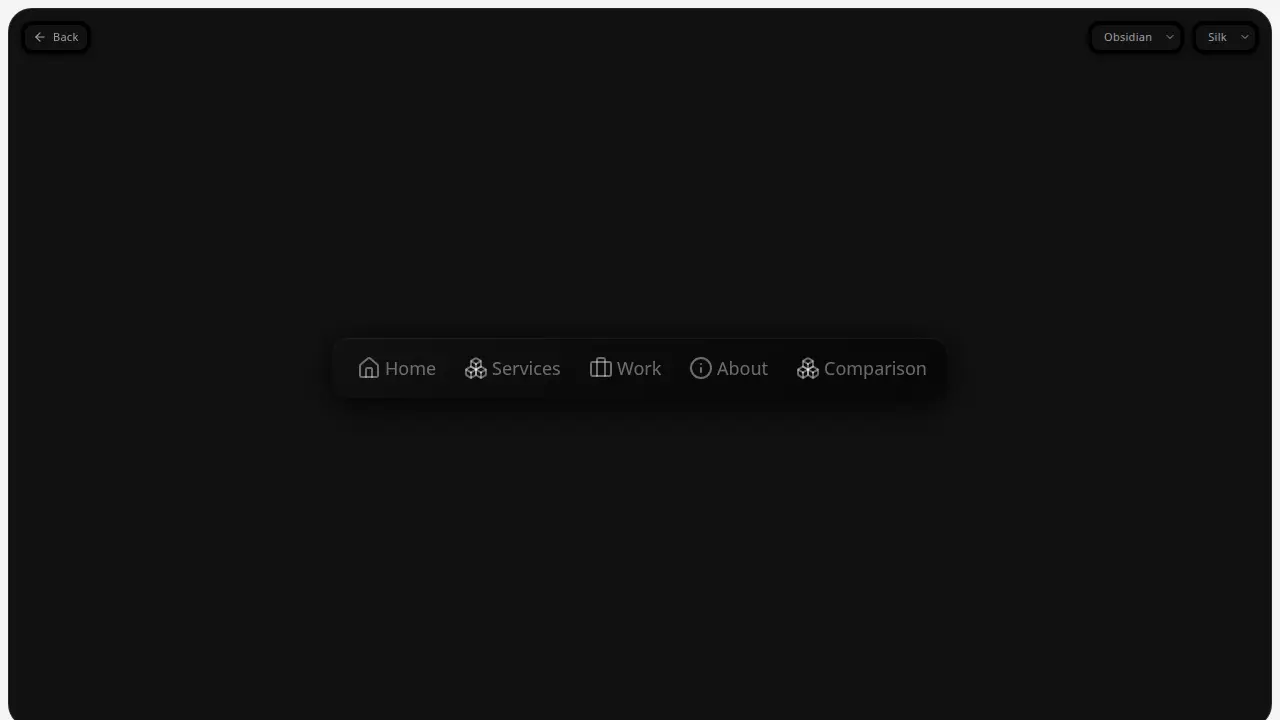
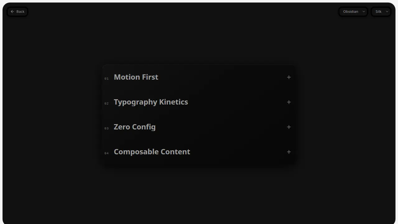
Index
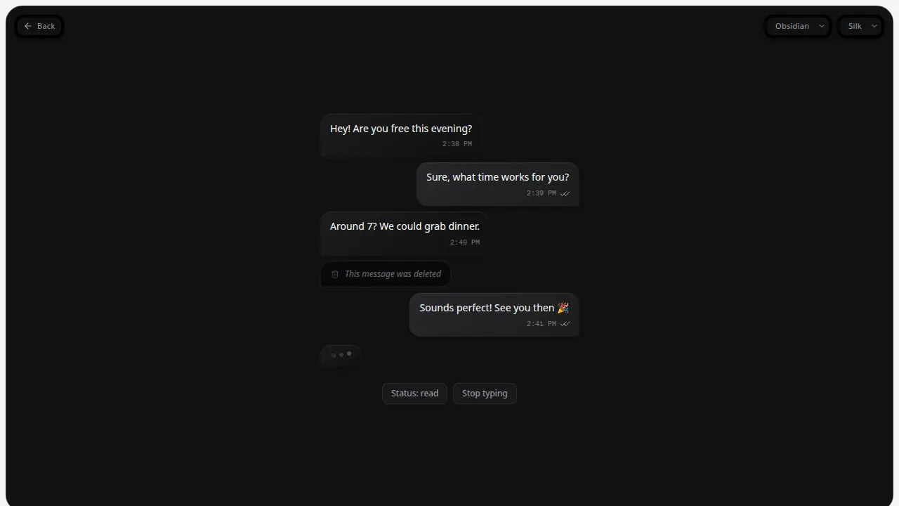
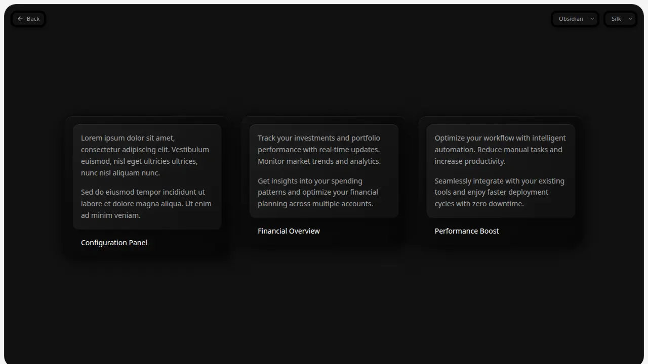
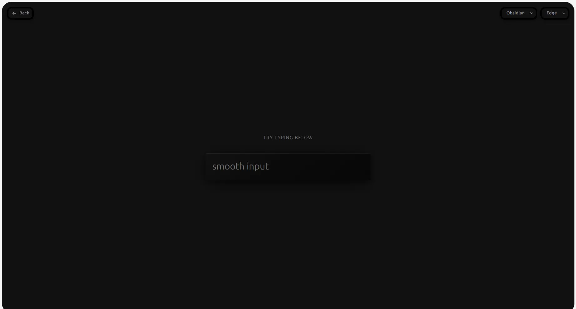
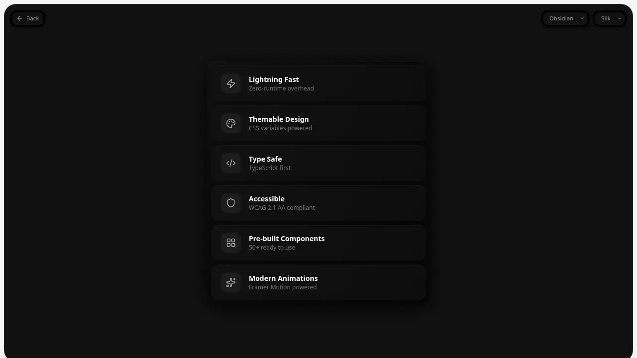
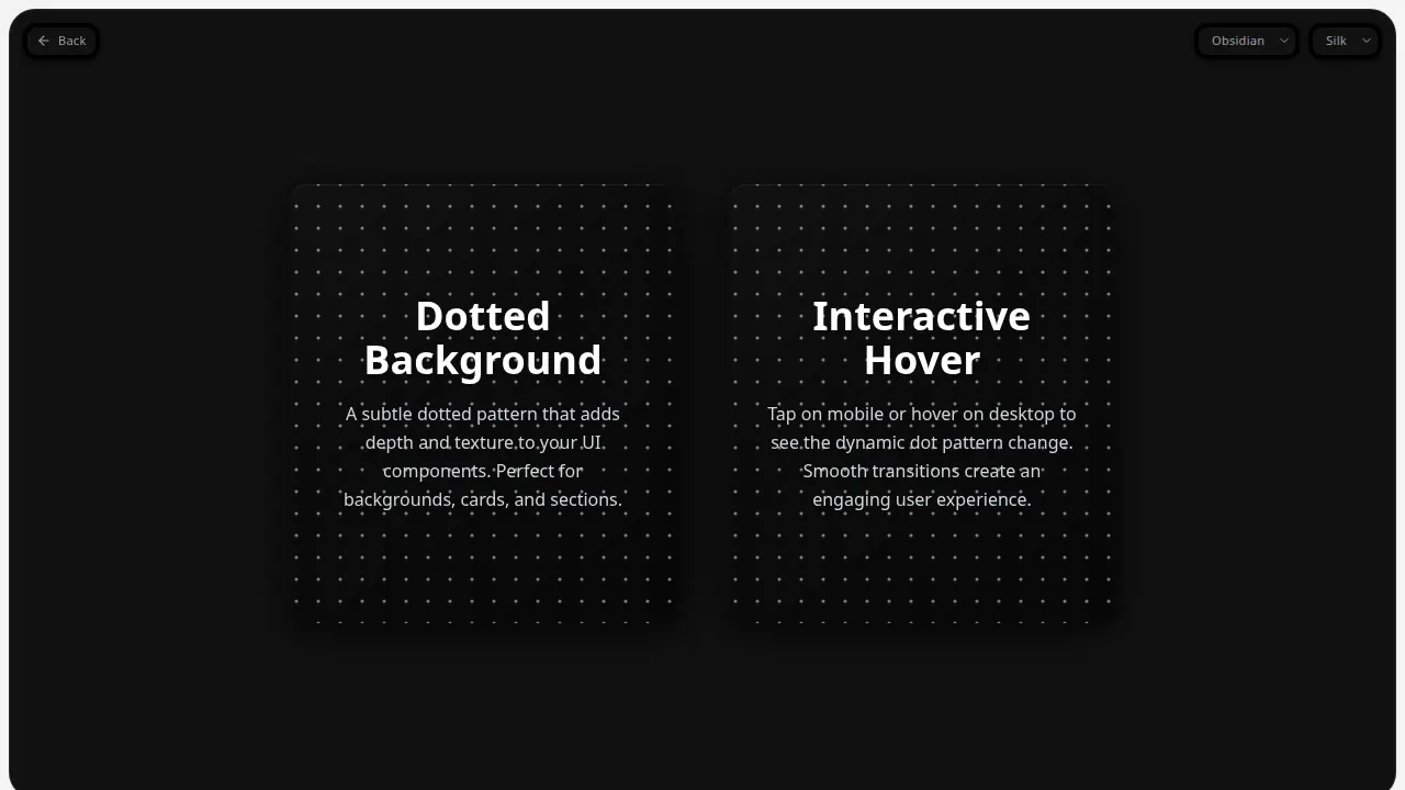
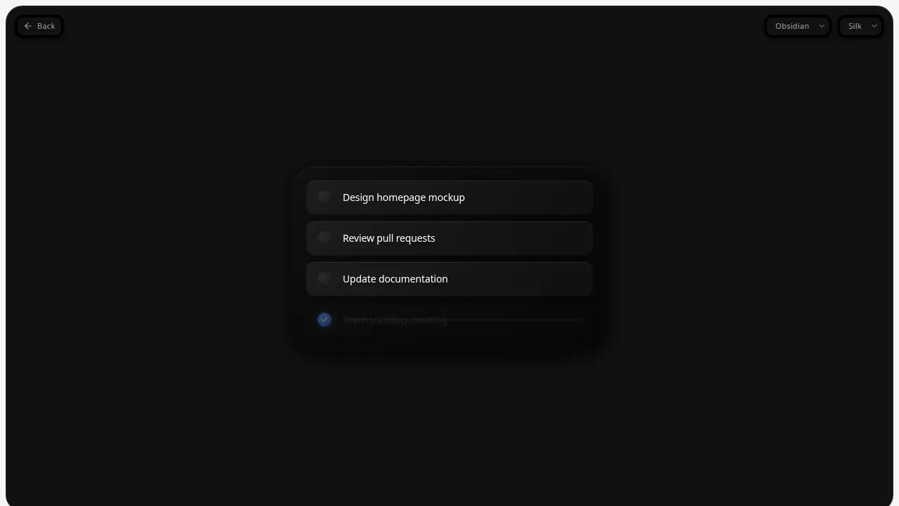
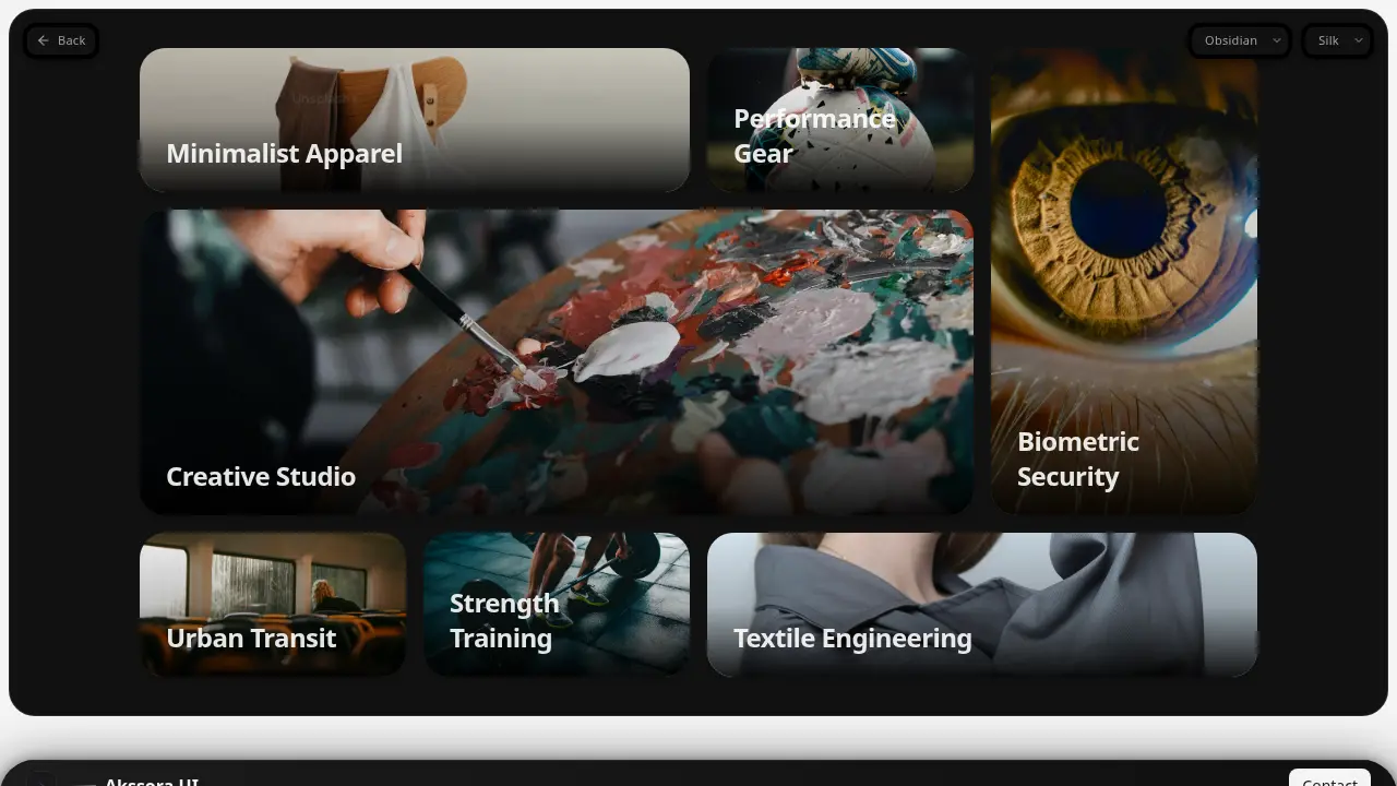
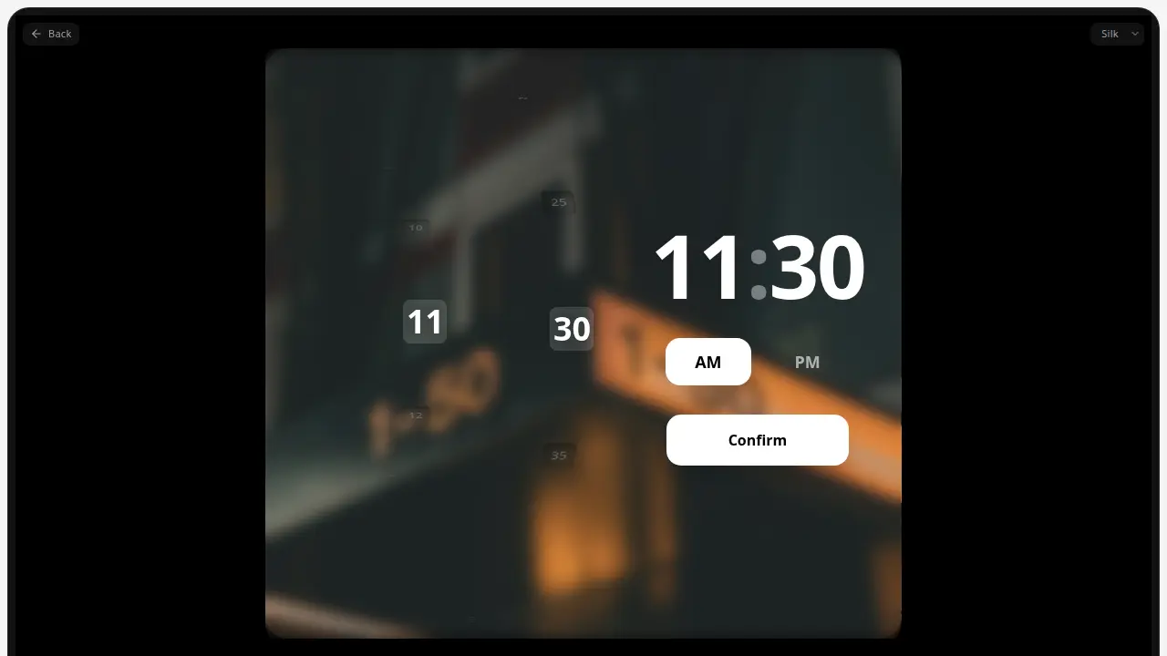
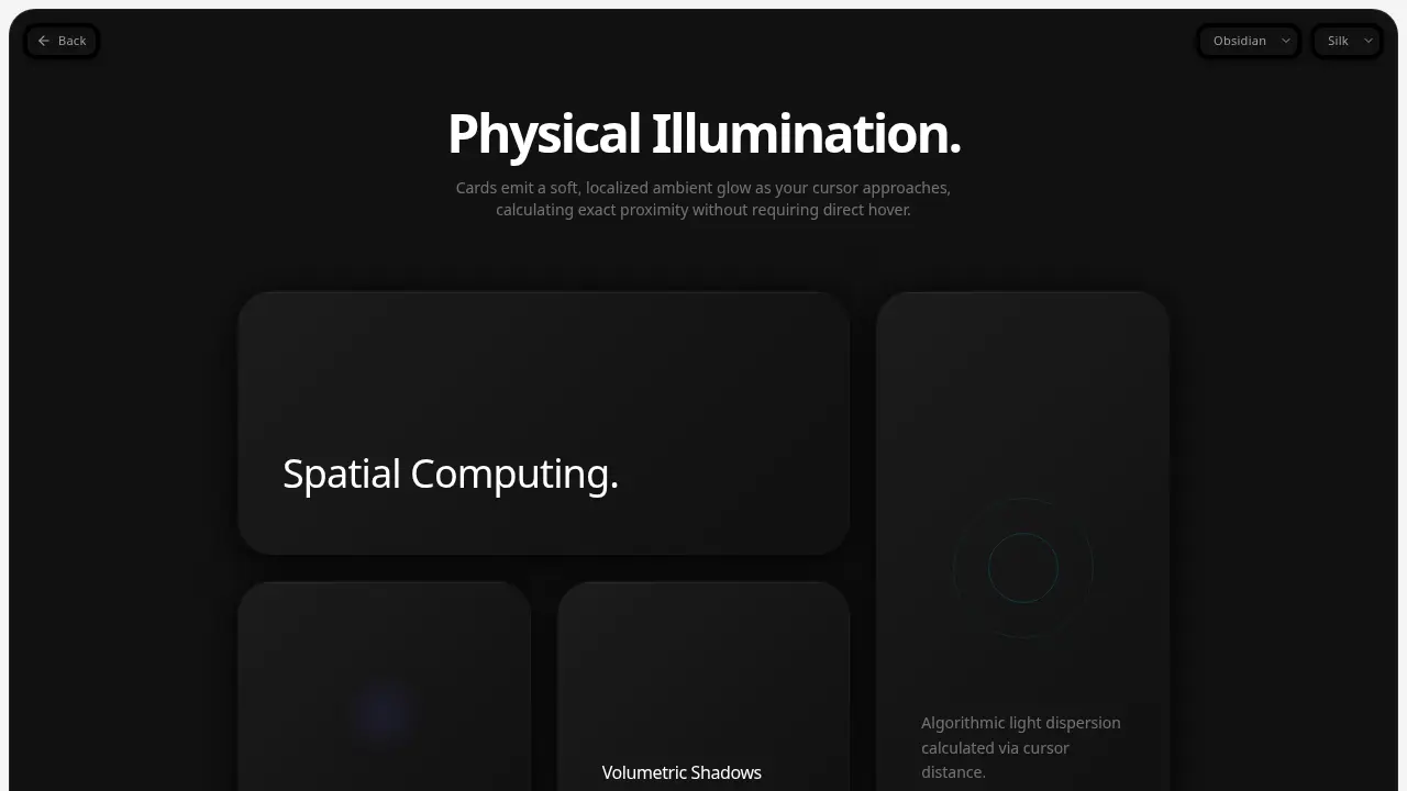
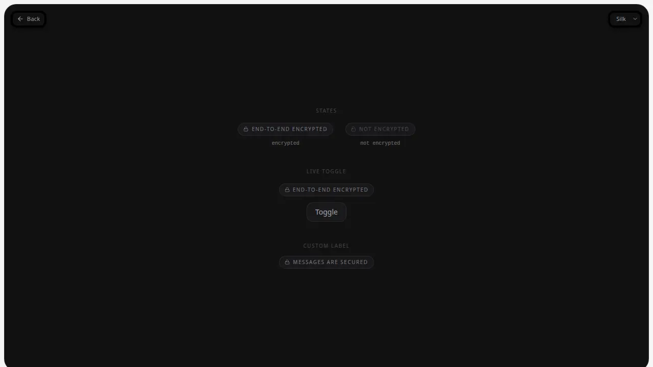
Components
A living index of small interface pieces.Results: 074Total: 074
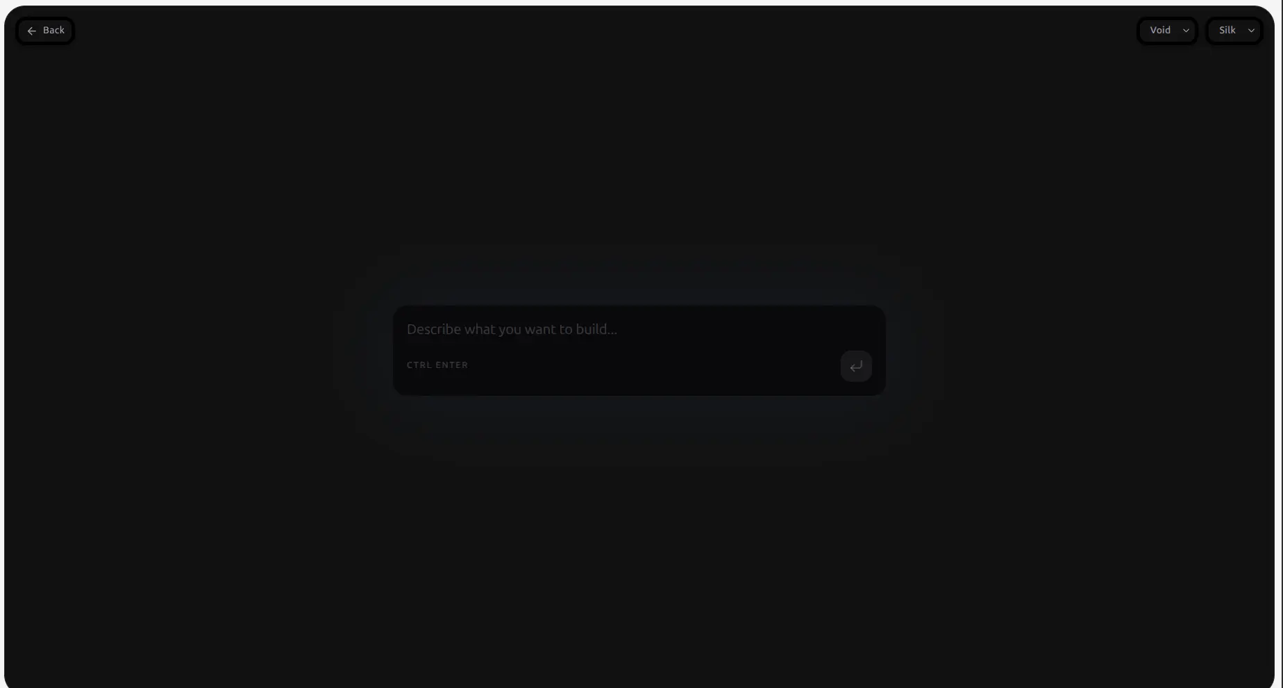
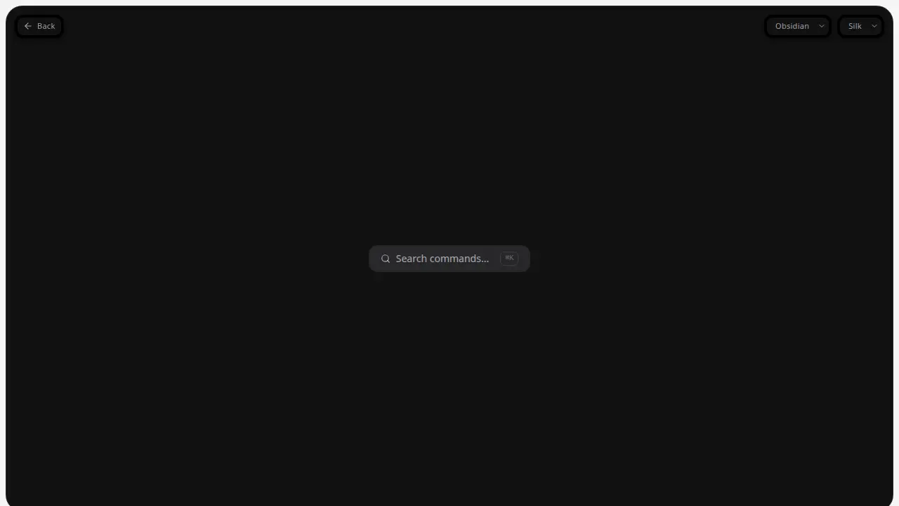
⌘K


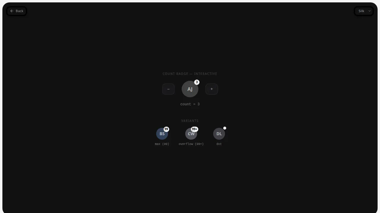
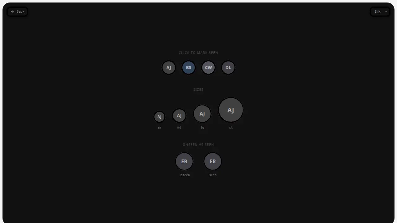
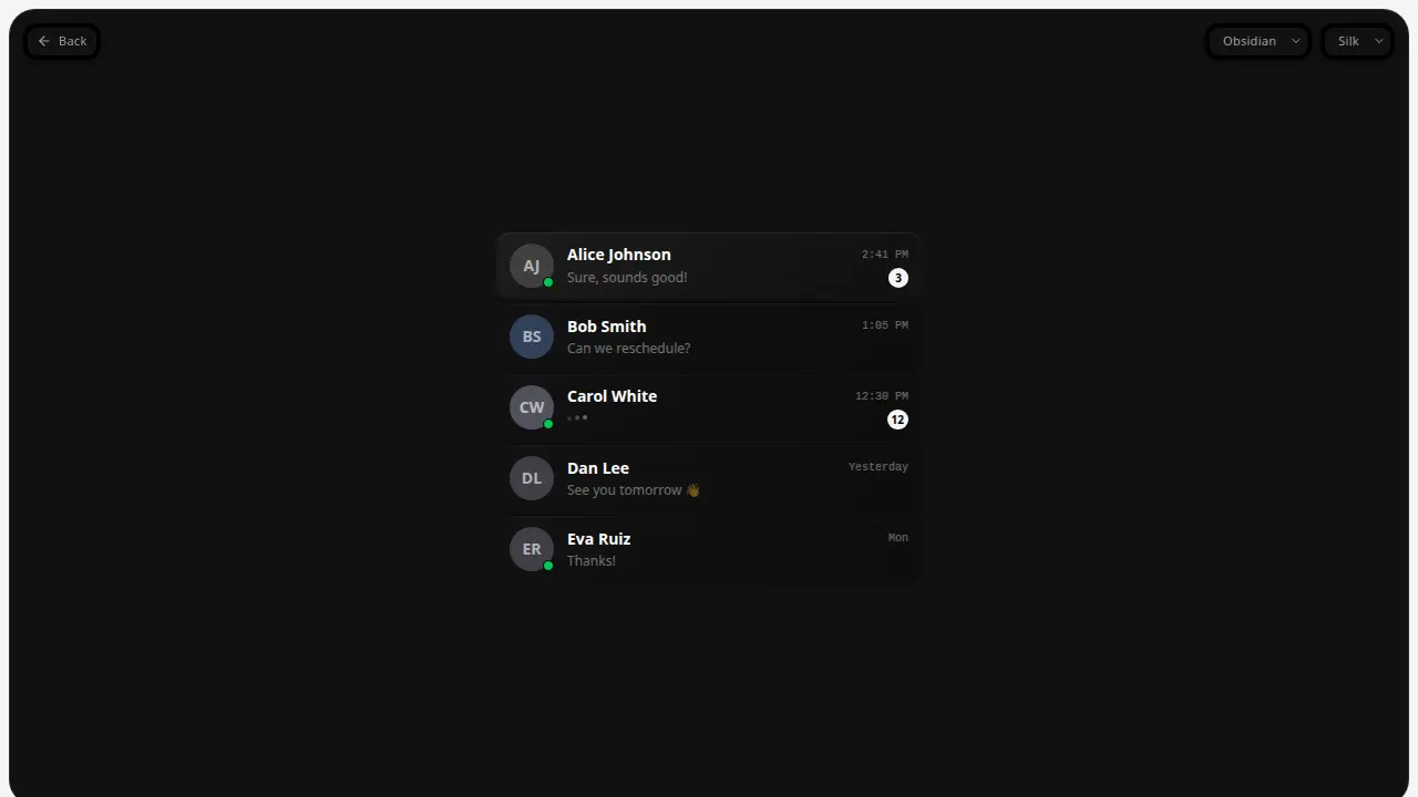
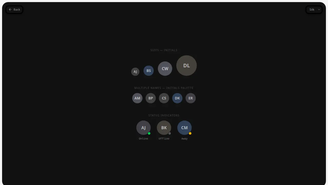
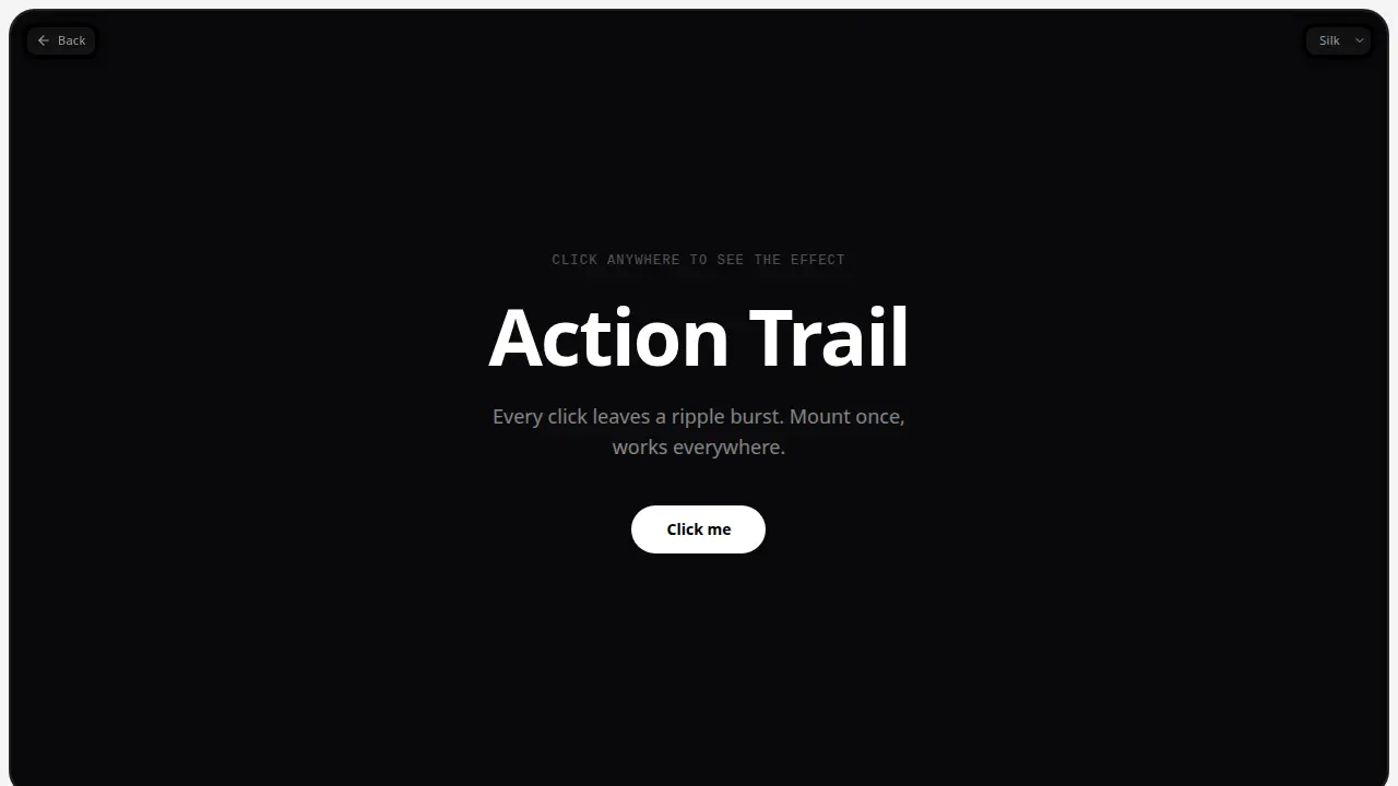


